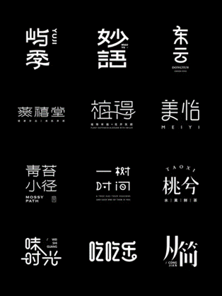
Chinese characters, more than just a writing system, are a living tapestry of history, culture, and human ingenuity. Unlike alphabetic languages, each character carries layers of meaning shaped by thousands of years of evolution. Let’s trace their journey—from primitive drawings to the fonts we use today—and explore why these ancient symbols still matter in the digital age.
1. The Origins: Symbols Rooted in Life (1600 BCE – 221 BCE)
The story begins with jiaguwen (甲骨文), or “oracle bone script,” the earliest mature form of Chinese writing, dating back to the Shang Dynasty. Carved on turtle shells and animal bones, these characters were used for divination—recording questions about harvests, wars, and rituals.
• Feature: Simple, pictographic (image-based) shapes. For example, the character for “sun” (日) was a circle with a dot in the center, mimicking the sun; “moon” (月) looked like a crescent.
• Next Step: By the Zhou Dynasty, jiaguwen evolved into zhongdingwen (钟鼎文), or “bronze script,” inscribed on ritual bronze vessels. The lines became thicker and more flowing, as metal casting allowed for more elaborate designs.
2. Standardization: From Chaos to Order (221 BCE – 220 CE)
Before the Qin Dynasty, China was divided into warring states, each with its own writing style—a barrier to unity. When Emperor Qin Shi Huang unified China in 221 BCE, he ordered the creation of xiaozhuan (小篆), or “small seal script,” standardizing characters across the empire.
• Feature: Symmetrical, curved lines with strict stroke order. Xiaozhuan simplified and规整 (guīzhěng, standardized) messy regional scripts, laying the foundation for a unified Chinese culture.
• Revolution: Soon after, lishu (隶书), or “official script,” emerged. Used by government officials for paperwork, it replaced curved lines with straight, angular strokes—making writing faster. This was a turning point: lishu is considered the bridge between ancient and modern Chinese characters.
3. The Rise of “Modern” Fonts (220 CE – 1912)
After lishu, two fonts became dominant and are still used today:
• Kaishu (楷书): Developed during the Wei and Jin dynasties, “regular script” is the neat, upright font you learn in Chinese class. Its strokes are clear and balanced, making it ideal for printing and education. It’s the foundation of most modern Chinese typography.
• Xingshu (行书): A more fluid, cursive version of kaishu, “running script” is used for handwriting. It blends speed and beauty—think of it as the “handwritten note” font compared to kaishu’s “printed book” style.
4. Today’s Meaning: Beyond Writing
In the digital age, Chinese characters have adapted (you type them on phones, after all!), but their cultural weight hasn’t faded. Here’s why they still matter:
• Cultural Identity: Each font tells a story. Jiaguwen connects us to ancient divination; kaishu represents order and tradition. When we see these characters, we’re touching a 3,000-year-old legacy.
• Art and Expression: Calligraphy—writing characters with a brush—is a major Chinese art form. A master’s xingshu can convey emotion through stroke thickness, just like a painter uses color.
• Unity: Despite China’s vast size and dialects, written characters are a common language. A person from Beijing and a person from Guangzhou may speak differently, but they read the same kaishu.
Chinese characters aren’t just tools—they’re a mirror of China’s past and a thread linking its present. Next time you type “日” or write “月,” remember: you’re using a symbol that has evolved with empires, adapted to technology, and still carries the weight of thousands of years. That’s the magic of these tiny strokes—they’re not just words. They’re history, alive in every line.